J. Gow
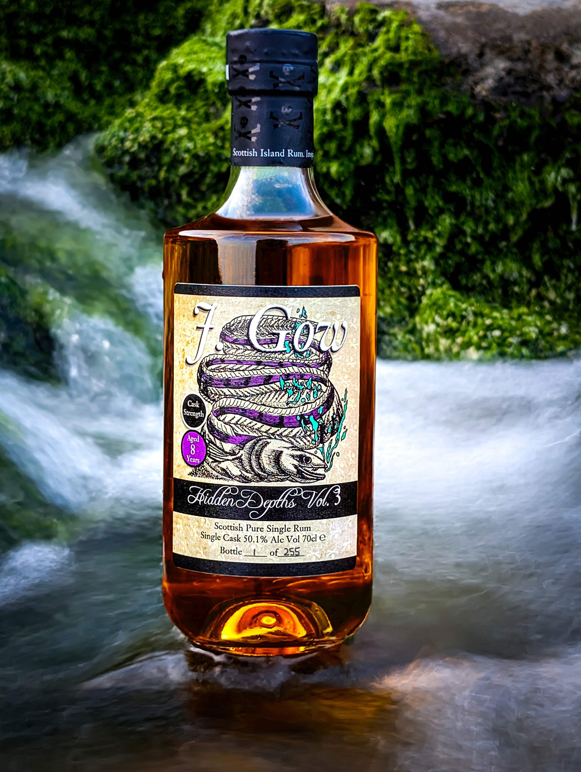
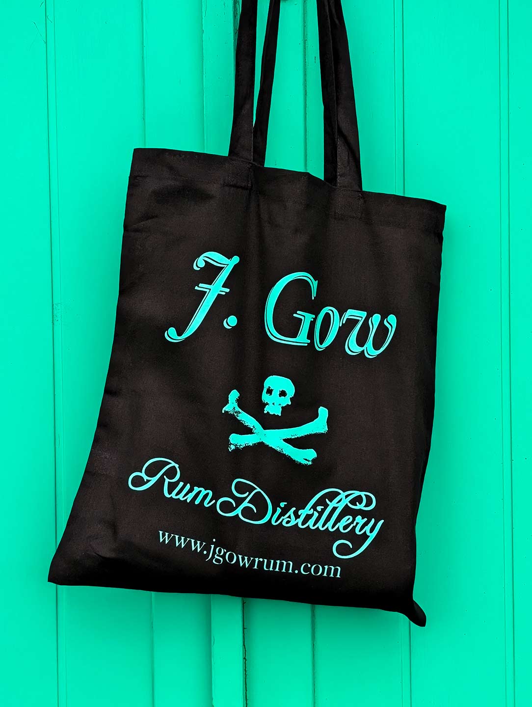
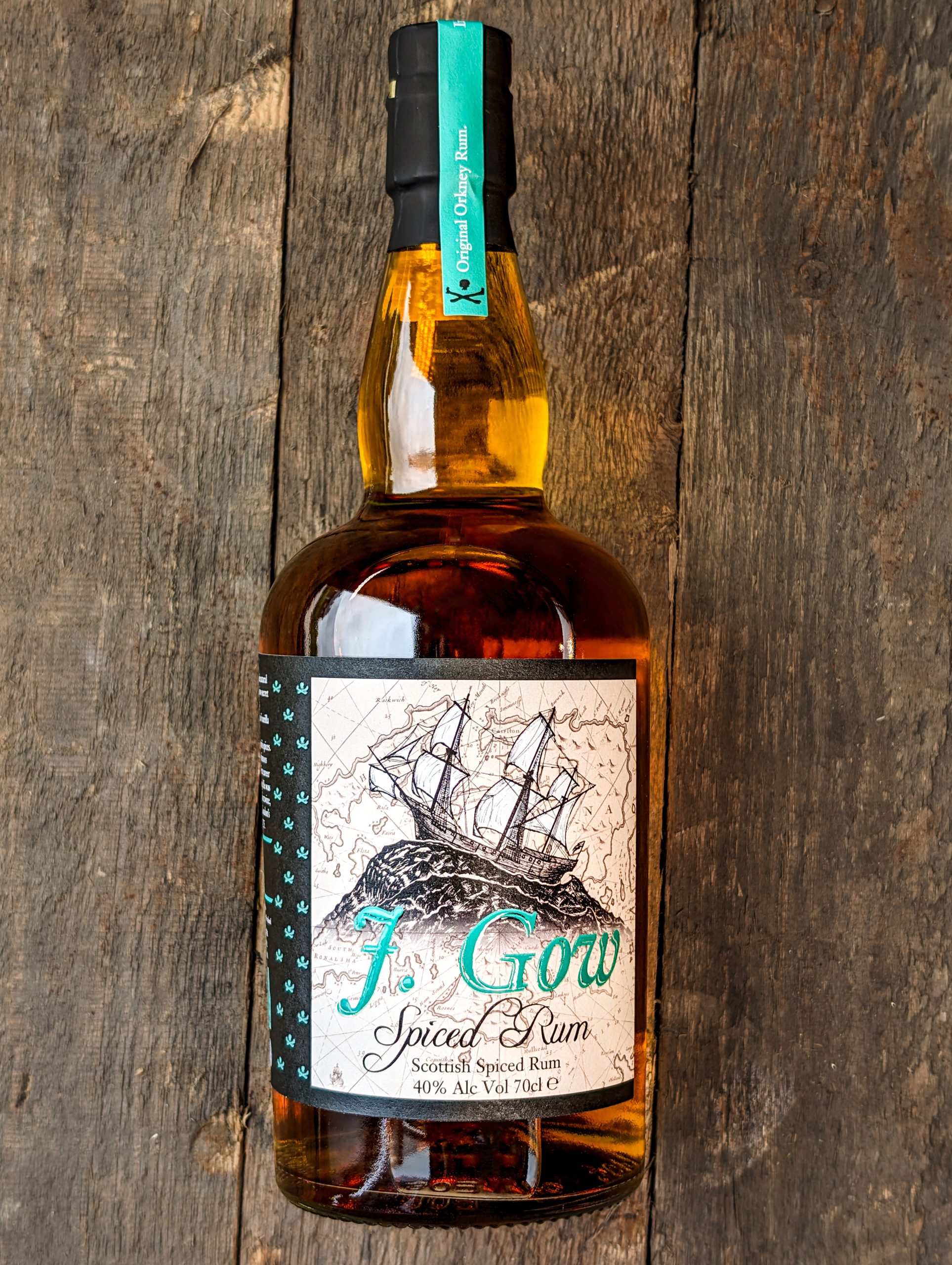
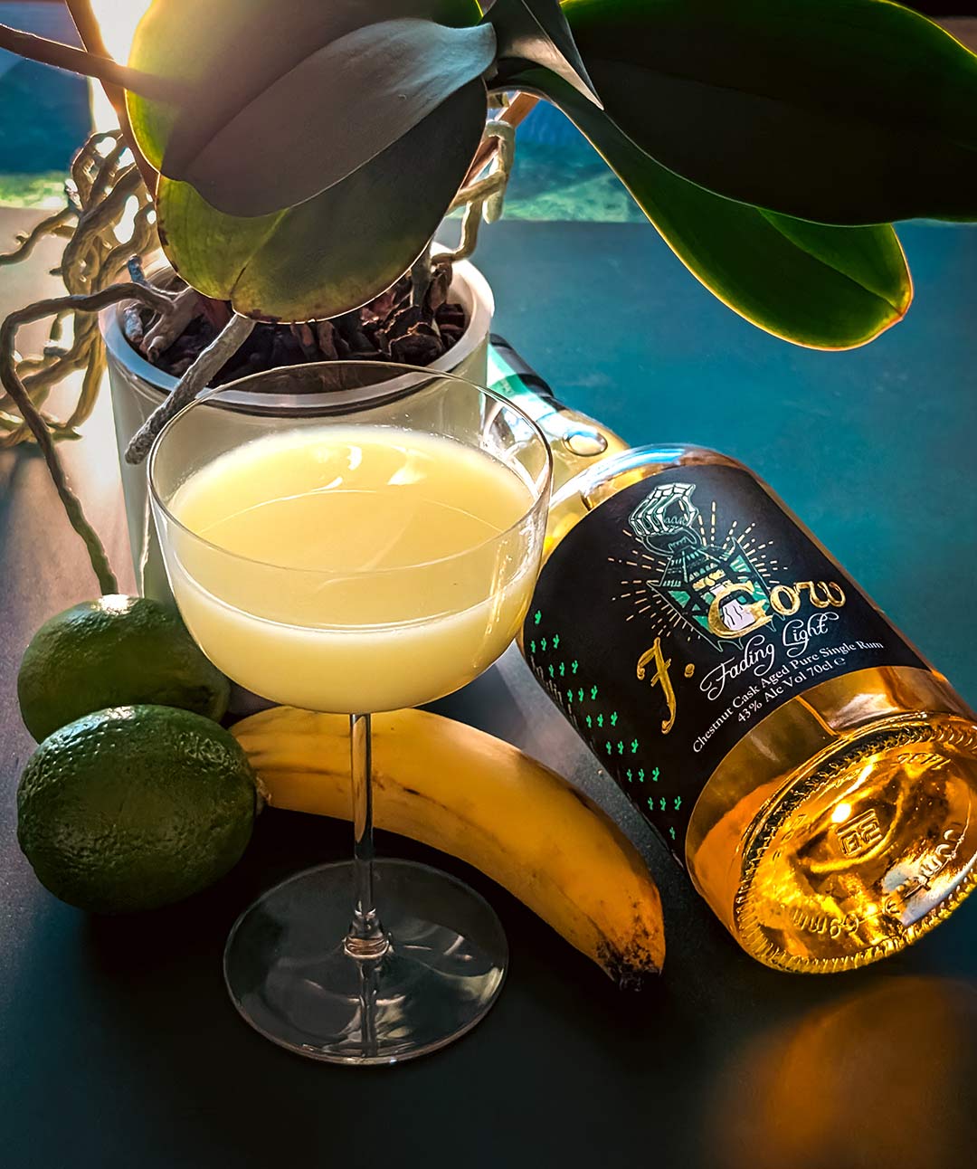
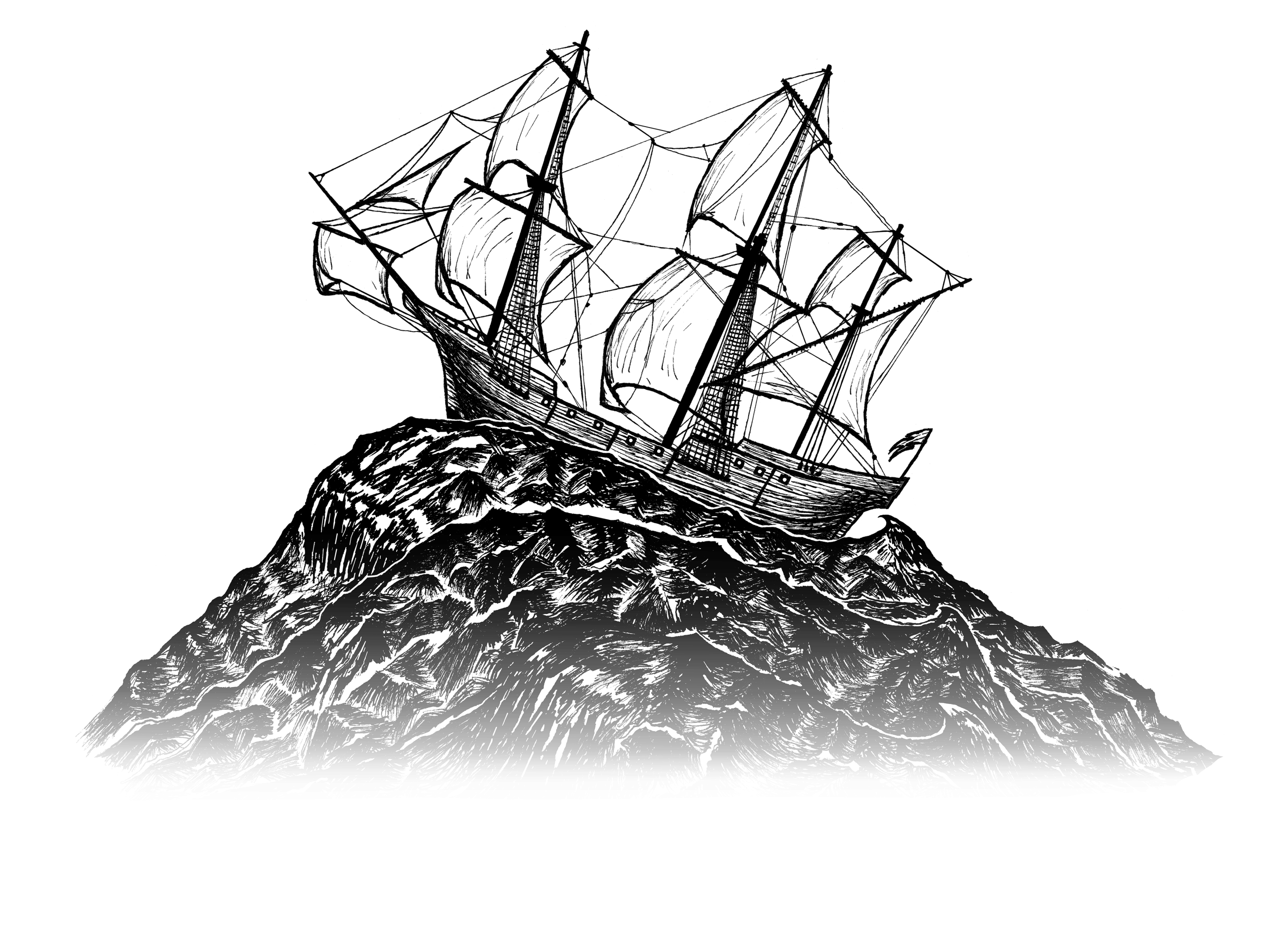
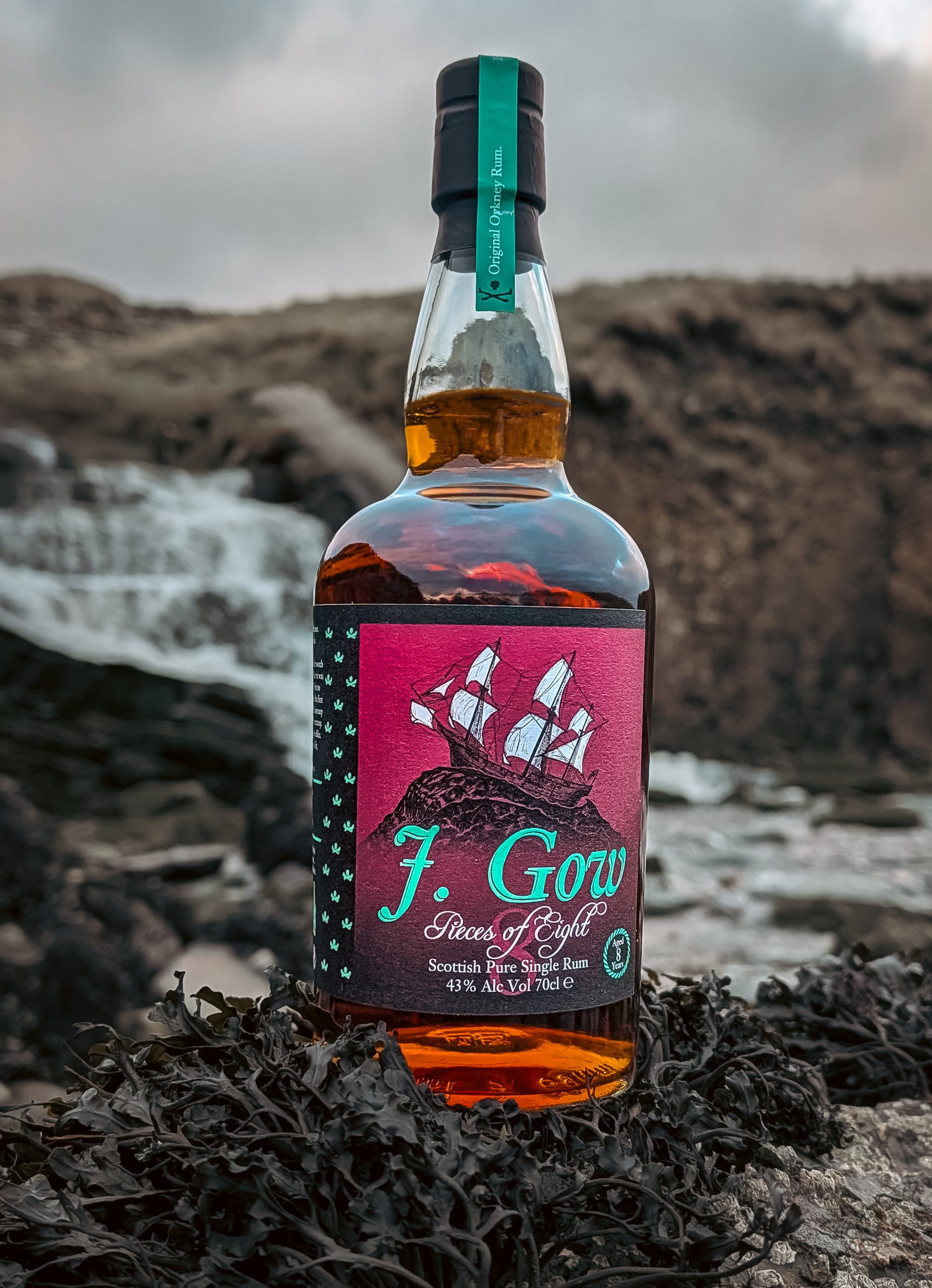
A collection of design work inspired by the bold, maritime identity of J. Gow Rum.
The project explores how a brand rooted in place and process can be expressed visually – capturing both the rugged environment of Orkney and the precision of rum-making.
Approach
Typography
Strong, serif-led typography referencing tradition, authority, and permanence balanced with clean, modern layouts.
Texture & Material
A focus on grain, print finishes, and imperfections, echoing wood, ageing, and the hands-on nature of distilling.
Colour
Dark, restrained, deliberate.
Nothing unnecessary. Nothing soft.
Composition
Structured, confident layouts with space to breathe letting materials and details carry weight.
Outcome
A visual language that feels controlled, but not clean.
Confident, but not safe. Built to last connecting modern design with a sense of history and place.